Introduction When I was at university studying GIS these three terms used to trip me up regularly when describing data. While all are similar, they have some distinct differences that you have to know when analysing data. Interpretation The first definition is interpretation. This is the first and most simple of the concepts being shown here. It is as simple and seeing what is happening in the data as it is. What are the trends or patterns being seen within the scope of the data available.
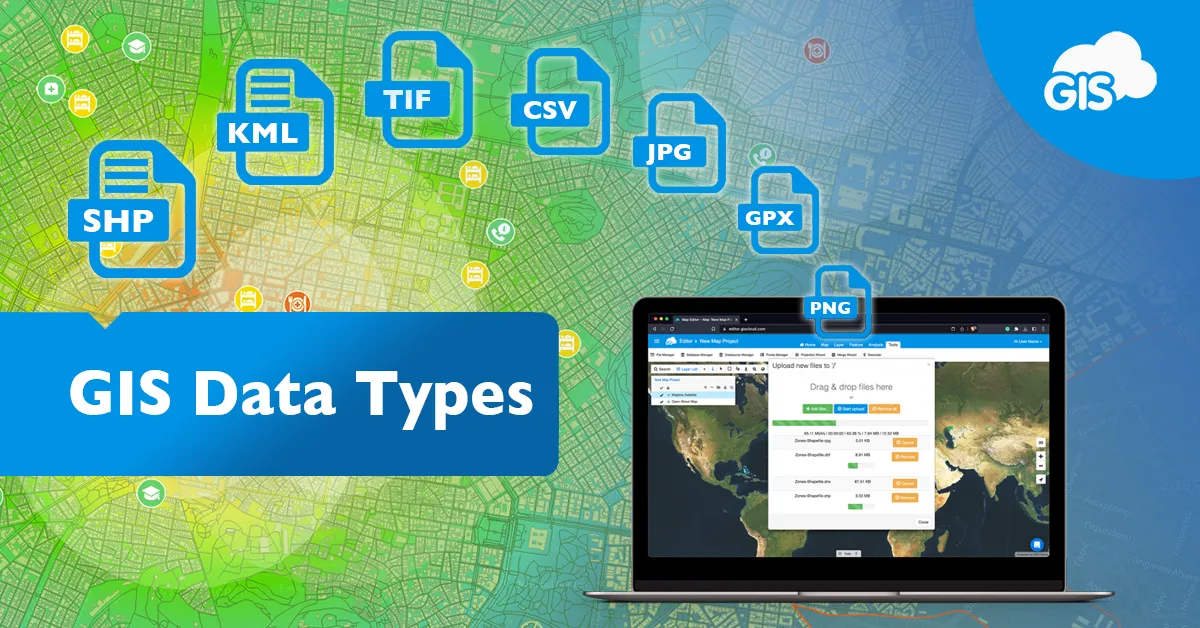
Introduction One of my biggest pet peeves as a GIS Officer is when I have received data as part of a task only to discover it’s in a completely different format to what is required or not all the relevant associated files have been attached leading to a corrupted piece of data. GIS data can be a little tricky to wrap ones head around with all the different tech jargon that gets thrown around so here is a breakdown of the main data types and file formats they are found in. What types of GIS data are there? There are two types of GIS data that you will come across: vector and raster. These two data types represent different phenomena in GIS and are very different in terms of structure and operation. Vector data refers to more traditional geometric geographic data in the forms of points (data with an x and y coordinate), lines (data with coordinates and lengths) and polygons/areas (data with coordinates and areas. Vector data can be used to visualize almost anything from pipes to buildings to wildlife habitat areas or even customer/ratepayer data. Vector data also have attributes attached to it which can be used to further visualize different phenomena within the data. The other GIS data type which you will come across is raster data. Raster data is made up of pixels with different numeric values assigned to each pixel. The most common form of raster data is satellite/aerial imagery with the numeric value of each pixel of imagery giving it an RGB colour which builds the image. Other forms of raster data include slope/elevation datasets, groundwater/catchment modelling and lidar data. In general vector data is used to represent discreet data (data with a distinct start and end) and raster data is used for continuous data (data with in between values such as surfaces). What are GIS file formats? There are literally hundreds of file formats that GIS data can take the form of, so I’ll list a couple of the major ones here; Shapefile (.shp and associated files) – The original and one of the most popular vector data file types used in Esri software. Feature Class (.gdb) – A relatively newer form of vector Esri file format, must be in a geodatabase and has a better functionality/connectivity than shapefiles. MapInfo TAB (.tab and associated files) – The native vector file format for MapInfo, must the converted before being used in Esri software. Keyhole Markup Language (.kml/.kmz) – Commonly called a Google Earth file as it is used to display GIS data in Earth browsers such as Google Earth. GeoTIFF (.tiff) – One of the most common raster data file formats although any picture file format (.jpg, .png, etc.) are also able to be read if they are georeferenced. Why is data so important? As I have previously mentioned data is one of the main pillars of what makes GIS so making sure you are using the required data for the task you intend to do is important for maintaining accuracy and legibility. For example, some tasks just physically wont work with raster data as they do with vector data and vice versa whereas some will give you wildly unexpected/erroneous results (think tools crashing and data not working).
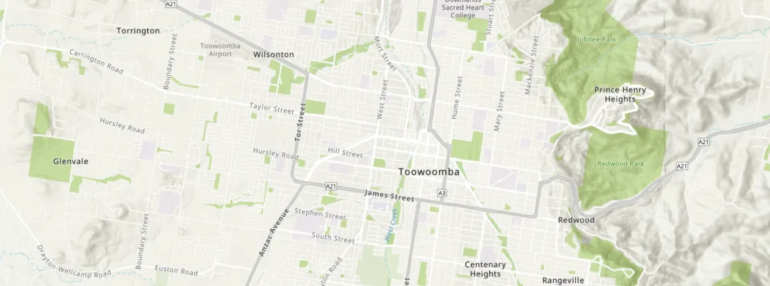
Introduction One of the main and easiest to understand parts of my role as a GIS officer here at Proterra Group is the production of maps that go into reports to easily display information. While it may seem a simple task there is actually a lot of forethought that goes into the preparation of a map and this can be the difference between a easy to understand way to convey information and something that is almost illegible. Map Design People read a map because they want to know where something is. With this in mind, there are a few features of a map that must be included. North Arrow – An arrow that points towards North based on the orientation of the map. For the majority of maps this is just the same orientation of the page however there are cases when a different orientation is useful (when mapping a road corridor for example). Scale Bar/Label – A bar or notation of the level of zoom the map is at. This also is useful for getting accurate measurement data from your map. Legend – A legend displays what layers are on the map and what they look like. Having a legend allows you to have multiple layers of the same type (lines, points or polygons) on one map while being able to differentiate between them easily. Map Credits – This is a simple acknowledgement of who created the map, who created the data and the date the data was from. This is important not only for copyright issues but also for legitimising your data. The Importance of Colour One of the main issues the beginner GIS analysts and officers run into when designing maps is picking the right colours for different features. While this may sound trivial, picking the wrong colours can leave your readers confused and lead them to misinterpreting the data you present. The first thing you must consider is that your colours do not look too similar to one another. While they may look different when you are creating the map, they may not have the same contrast when printed or rendered by different computers. Similarly certain colours are associated with different features. For example, the colour associates with water is blue so for someone having a cursory glance at your map will see blue and assume it has something to do with water whereas if you coloured a river line feature red that same person would most likely not realise what the feature is. Handy Hints and Tricks Some other things to consider include How your features are labelled. Making sure features and labels don’t overlap covering the data you want to display. What basemap you use and how it interacts with your data. Title blocks, tables, images that can be added. The drawing of features such as arrows and shapes onto your map. Using patterns, hatching and gradients to differentiate data along with colour to be inclusive for people with sensory issues such as color blindness. And remember, maps are a great way to visualise and disseminate your data to a wide audience of people in a short period of time.